
Backwards
I was prompted to create a zine that displays my unique design principles, rationales, perspectives, and origin points. Backwards explores a mistake I made at the earliest point in my design journey, and what I have learned since that experience.
Copywriting
Illustration
Typesetting
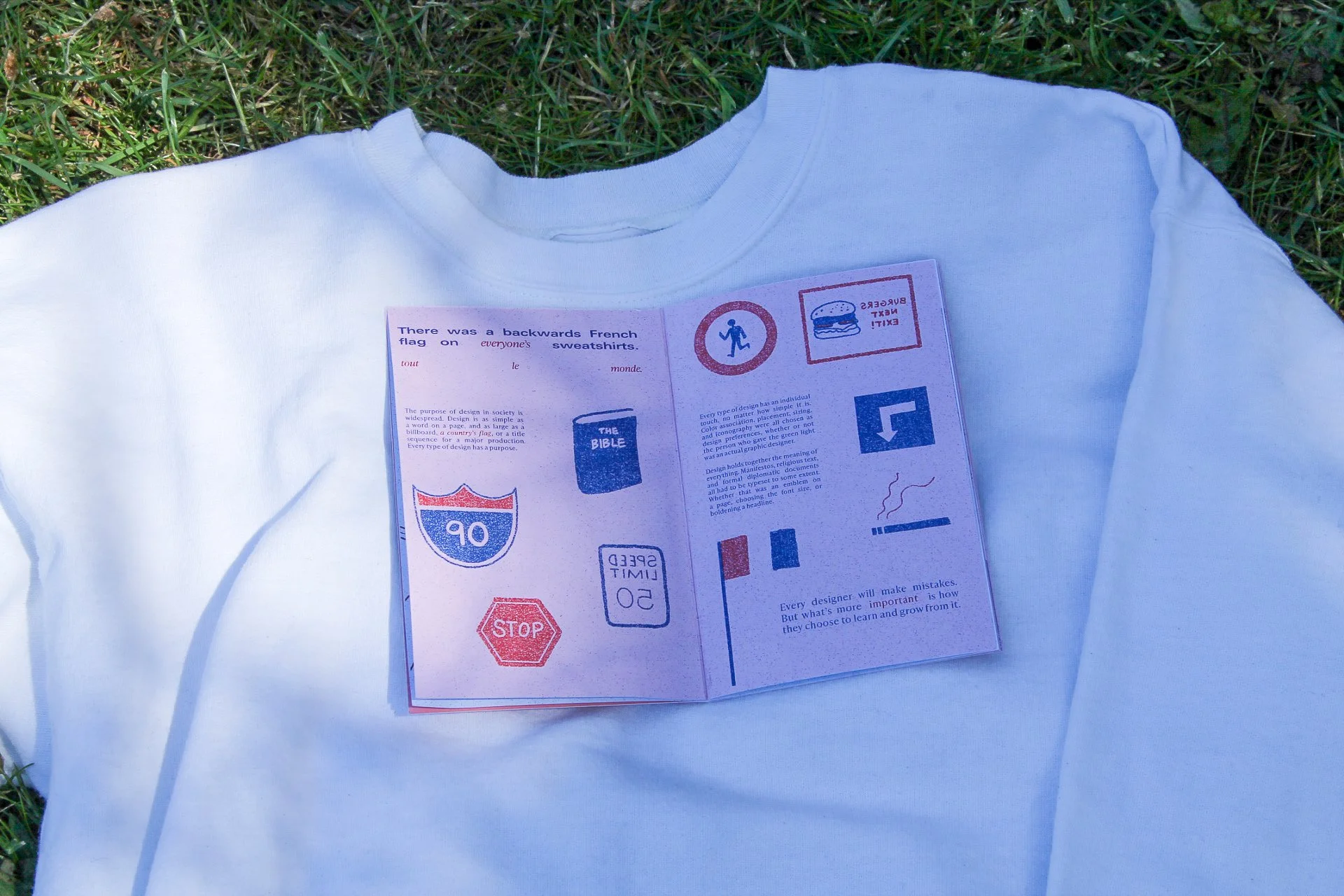
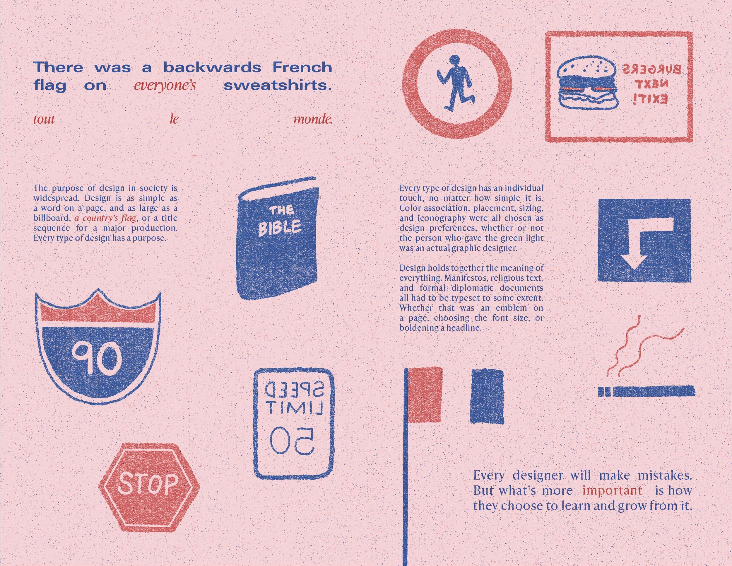
Storytelling


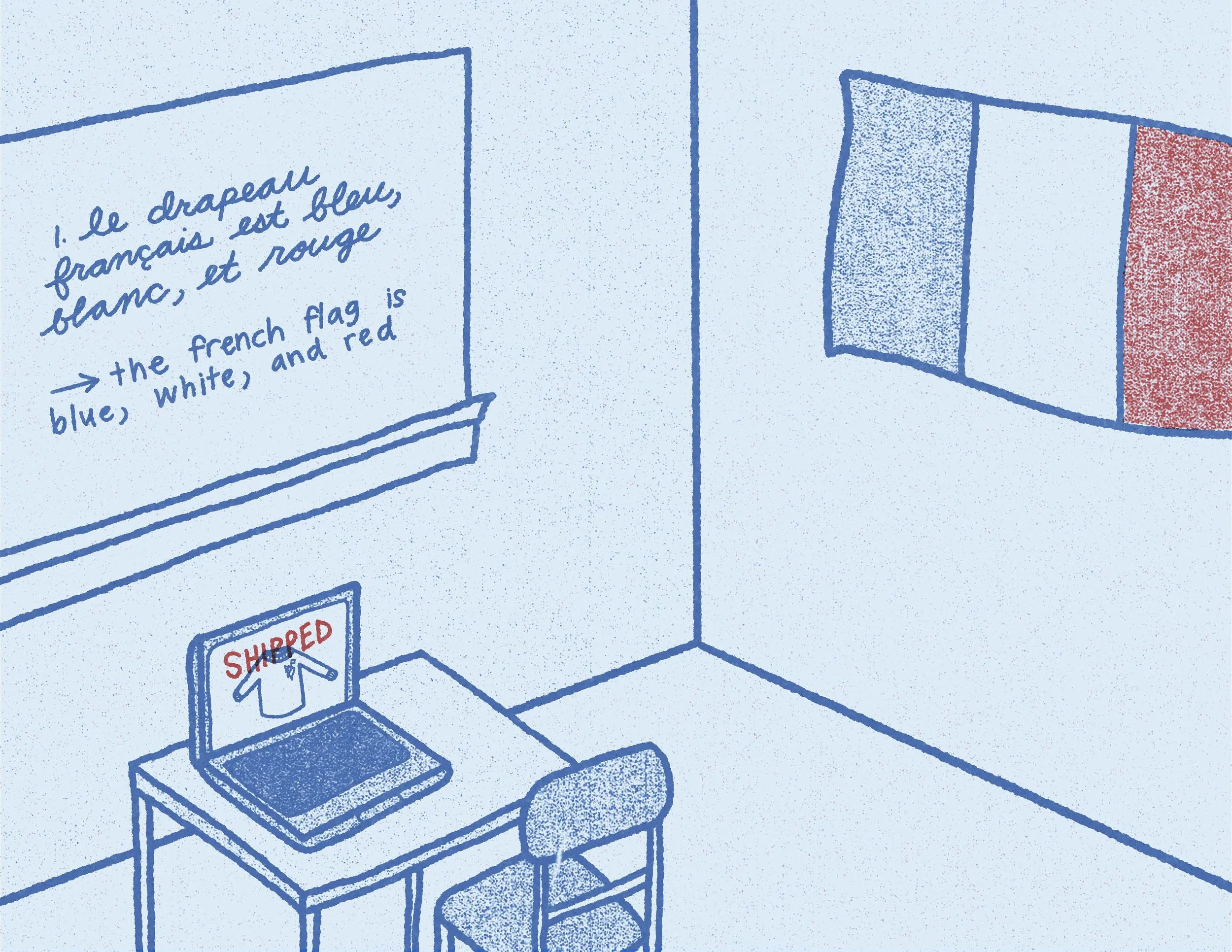
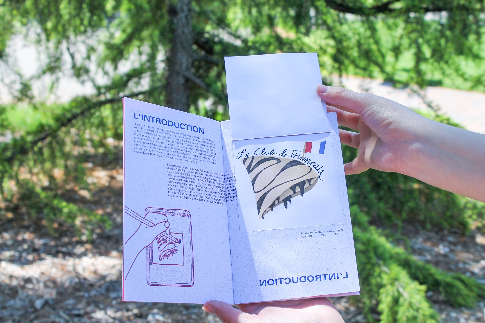
“When I was a senior in high school, I designed a French club sweatshirt. I decided to illustrate a crepe with a French flag toothpick sticking out of it. After it got sent to print, I realized the French flag was backwards. It was the biggest graphic design mistake that I’ve made to this day.”


Tactile Pages
I also experimented with making specific pages of this zine interactive. This is an example of an envelope on a page that the reader is able to open and read a letter addressed to all French people: dual translated in English and French (my own writing in French, fyi)!


Spot the Difference!
Another tactile page in this zine is the “Spot the Difference,” where you are able to search through different french flag toothpicks, and choose the correct one. That was something I apparently wasn’t able to do when I made the design (I can now, don’t worry).

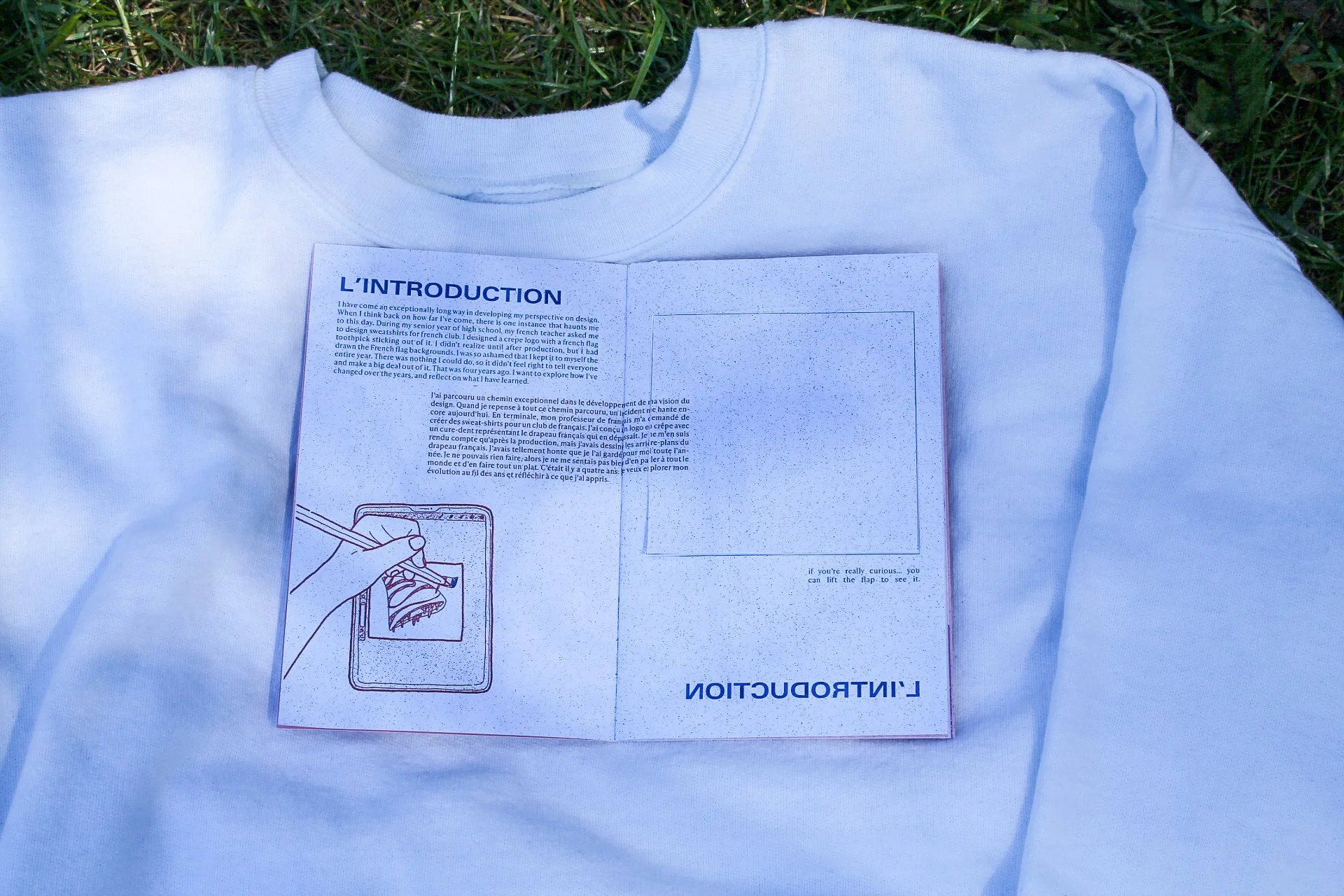
Lift the Flap
Finally, my last interactive element was a lift the flap page. I was ashamed to include the original design in the zine, but it felt integral to the story. This was a challenge in being vulnerable.

“[The incident] was so long ago, and the amount of time I’ve spent into developing my design skills proves that I have put in the effort to move past this incident. I’ve grown away from drawing countries’ flags backwards.
I am free. Au Revoir.

